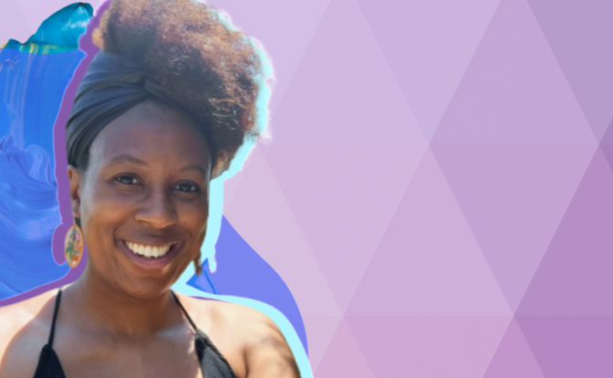
Self-identifying Black Women in STEMM: Reclaim Your Crown
The Director of Outreach at 500 Women Scientists & the Co-Founder of the Black Women’s Collective speaks out about hair discrimination and being an African American woman in STEMM.

The Director of Outreach at 500 Women Scientists & the Co-Founder of the Black Women’s Collective speaks out about hair discrimination and being an African American woman in STEMM.
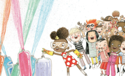
Children’s science books are one way to keep changing the face of science, so here are ten more recommendations for you.
September 15th marks the start of Hispanic Heritage Month in the U.S., an initiative launched to celebrate the many contributions Hispanic and Latinx people...

Joe Biden has called upon businesses to "step up with vaccine requirements."

We cannot erase stigmas surrounding any historically-excluded groups without first acknowledging their existence.
Women's History Month drew to a close March 31, a day also marked by Transgender Day of Visibility. In honour of it, GLAAD released an open letter in collaboration with Raquel Willis pledging solidarity with trans women and girls worldwide.

Bumble is the latest in a growing list of big-name employers who are attempting to alleviate the stress and anxiety that comes from being hyper connected.

Employees are often shocked to find their dream job involves menial tasks and drudgery. While they need to manage their expectations, employers should also be more honest about the true nature of the jobs they’re hiring for.

On Tuesday, global business collective The Valuable 500 (Valuable) announced reaching its goal of having 500 international businesses commit to greater disability inclusion, Valuable announced in a press release.

One of the largest disparities between Black employees and other employees was found in Registered Nursing roles.
Researchers say their paper is among the first to focus on the challenges students with ADHD face in college while offering suggestions on how to better support and retain this demographic.
Both sex and gender analysis are crucial to health research to enable access to appropriate health information, diagnoses and care for gender-diverse populations.
Competitors will have to step up to fill up the gap, but their capacity to do so may be limited.

Each tragic discovery or incident is an opportunity to act. But repeatedly Canada’s decision is no action — or insufficient action, and the next thing happens and we’re forced to grieve and call for action again.
EDITOR'S NOTE: May 10-16 is National Nursing Week in Canada, an initiative created to celebrate the countless contributions nurses make to improve the well-being...
The world is powered by computers, and that isn't going to change any time soon.

Not surprisingly, success leads to more success.

U.S. students are dropping out of college or failing to enroll entirely, with Black and Hispanic students from low-income communities among the hardest hit demographic, according to a recent report.
Ministries of education need to embed ongoing anti-racist training into their teacher education programs. Short-term anti-bias training has little impact.

There’s a difference between ‘equity and ‘equality.’ One of the best visual representations we’ve seen of this concept was created by Angus Maguire for the Interaction Institute...

The Mars 2020 Perseverance team represents a diverse team of scientists and engineers from a wide range of disciplines -- encompassing everything from geology, to planetary science, to computer programming, to robotics.

Caleb hopes to be the first person to visit Mars.

The crash occurred less than two weeks after the National Science Foundation announced the site was to be decommissioned. The massive telescope, which had been in ser